
First, let’s clarify the definition of branding, which is a set of marketing techniques that aims to give meaning to a specific company and its products, by shaping the brand in the minds of consumers.
In the case of design, branding is the use of distinguishable features that make a brand’s products or services easily recognizable. Visual elements such as the brand logo, brand colors, typography, and the style of graphic designs, all help create assets and images which people can instantly identify and associate with the brand itself.
Medium is one prime example, where its functionality and aesthetics stay true to what the brand stands for. Being an online reading and publishing platform, their design and color palette is very simple and minimalistic, whereas their typography is sleek yet comfortable on the eyes.
When a user logs in, there will be a “Write Here”, which encourages them to write an article of their own and are provided with a clean and empty space to get their creative juices going. Medium also makes sure that their articles are structured neatly for easy readability and digestibility. They even have little features here and there to aid users in having a more enjoyable reading experience, such as the ability to highlight key points and share it on social media, see the most popular ‘highlighted lines’ by other readers, and even the option to get in touch with some of the authors directly.
What has UI/UX Design got to do with Branding?
Both UI and UX Designs are needed to give the ultimate customer experience. Think of it this way, a brand’s website design influences a customer’s experience of the brand. Hence, a good web experience puts the brand in a more positive light, thus contributing to the brand building process.
Let’s take a look at one of the most successful brands ever — Apple. The brand’s logo stands to be one of the most – if not – the most well-known brand icon to date.
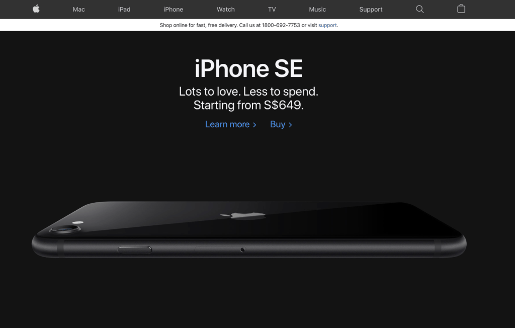
However, as important as their logo is, Apple’s brand success is not just built on a single half-bitten icon. It’s branding has cascaded down to every touchpoint of the brand itself — from its products to its website, no interface is spared. Apple recognizes that every one of these are opportunities for the brand to communicate and reflect a consistent image of what it stands for, and that’s what makes it successful. Taking a closer look at Apple’s website, their design is largely minimalistic, allowing the high impact product visuals to shine through. The entire website has a very sleek and clean-cut design, which are the exact same words you would use to describe their products as well, thus showing the consistency in their branding. Apart from just “looking good”, their website is also relatively easy to navigate, ultimately ensuring that customers have a good user experience.
Now that we have highlighted an outstanding example of a good UX experience, let’s look at some UX designs that are a huge no-no. One design mistake that web designers are usually advised against committing is Mystery Meat Navigation (MMN). This is the situation where the destination link does not appear until a user either clicks or hovers the cursor over it. According to Vincent Flanders, the web designer who coined this term, such websites are usually confusing and counter-intuitive for the user to navigate. Just take a look at Lazor Office’s website. In the screenshot below, you can see that this entire webpage has no words and/or buttons — absolutely nothing. Only when the user hovers over these images, then does the cursor change to one that suggests that they are clickable. Albeit displaying many high impact visuals, a webpage like this without any other visual cues would lead to a user questioning, “what now?”. When there is little to no indication to show the next possible step to take, users will end up being unable to properly interact with the site, causing them to have a poor user experience or worse, causing you to lose site visitors and potential customers.

Furthermore, click into anyone of these projects and you will be greeted with a wordy page below a single hero image. With no proper paragraphing, capitalization and a copy that looks like it is copy-pasted, this is an experience that can prompt users to leave the site altogether. Remember, when it comes to web, your UX experience and your brand experience are synonymous.
We’ll cover more about UX in future articles…
3 Design Elements To Aid Your Branding
What are some elements of UI design that can help bring your visual brand identity to life on your website? Branding through visual design depends heavily on three main elements — color, typography, and placement.
Colors make up one of the main elements for anything visual because it sets the mood of the entire image and influences how your customers feel. So whatever emotions your brand is trying to express or elicit, colors are the way to go.

As you can see from the chart above, different colors evoke different kinds of emotions in your consumers (Image: TheLogoCompany). With red symbolizing energy, exciting flavors and taste, we have brands like KFC and Coca Cola that use it to appeal to their customers. For big and successful tech brands like Facebook and Dell, they use blue as their primary color in order for their customers to feel a sense of trust and dependability toward them. Colors play a huge role in how customers perceive your brand so choosing the right colors to represent your brand is crucial, especially when it comes to creating your UI design.
Typography – the font choice – is used to convey your brand’s message in its own way/personality to your users. Not only does it have to be unique, but it also has to be suitable across all platforms, yet stay true to your brand, all at the same time. Sounds like a lot to handle right? Not to worry, let’s start here: In order to know what kind of typography fits your brand, first figure out what kind of personality your brand embodies. Twitter’s cartoonish font is very distinctive, and its rounded edges reflect its weird and playful personality (Image: Creativeblog).

You would know that you have nailed the typography once it gels well with how you would want your brand to be portrayed. This will give your website a more cohesive feel, one that is consistent with your branding.
Lastly, for the seemingly trivial yet critical details on your website — placements.
As a user navigating a website, you will find that there are some universal placements for certain buttons and elements, in which we as users are already comfortable and familiar with — logos at the top left, menu bars at the top right, and CTA buttons at the bottom. These common placements will allow users to navigate your website comfortably and effortlessly, without having much trouble finding what they want.
To infuse your brand identity in the placement of these elements would be a little challenging, because there has to be a balance between making your website one-of-a-kind, yet ensuring that it is still familiar and intuitive enough to navigate. Hence, if you make it too different, it might break the flow of the website and can confuse or even shock users, adversely affecting their web experience. Having said that, you can still endeavor to introduce new elements in your UI design, but don’t stray too far away and always test the UX with what we call “usability testing”. Through this, you would sometimes discover flaws that you would not have noticed before, and start to understand how to better improve the user experience into a more seamless and enjoyable one.